

Those look like Fifth Element stone logos.Dub Rubb wrote:I don't know how I never saw this thread. But while looking for the street art thread I found it! Coincidentally, I was dreaming up some ideas earlier. Don't do computers much, so I was using the trusty old sharpie lol.
Sent from my LG-M322 using Tapatalk
MoT Logo?
Re: MoT Logo?

-
The Sultan of SoWhat
- MoT Member
- Posts: 5385
- Joined: Wed Dec 19, 2018 8:52 pm
Re: MoT Logo?
Zombies?
Or maybe IKEA projects gone astray?
Or maybe IKEA projects gone astray?
Re: MoT Logo?
Great thread and ideas. What about if you embrace the triangle idea and extend the side arms of the T all the way down so they nearly meet in a point along with the verticals of the M.
Perhaps have the O / clock face at the bottom point - i.e. being the nexus of the verticals - rather than cross bars and much smaller?
Sent from my SM-G960F using Tapatalk
Perhaps have the O / clock face at the bottom point - i.e. being the nexus of the verticals - rather than cross bars and much smaller?
Sent from my SM-G960F using Tapatalk

Re: MoT Logo?
Honestly, this makes it SOOOO much cooler in my book! Never even pieced that together.Robotaz wrote:Those look like Fifth Element stone logos.Dub Rubb wrote:I don't know how I never saw this thread. But while looking for the street art thread I found it! Coincidentally, I was dreaming up some ideas earlier. Don't do computers much, so I was using the trusty old sharpie lol.
Sent from my LG-M322 using Tapatalk
Sent from my LG-M322 using Tapatalk

Re: MoT Logo?
The ‘watch face’, and I will play with that a bit more later to try and improve it, currently takes its ‘lines’ from the T and M and uses those for the hands. Moving the ‘O’ would remove that alignment. It is fine to remove the alignment as long as we are consciously making that design decision.baldrick wrote:Great thread and ideas. What about if you embrace the triangle idea and extend the side arms of the T all the way down so they nearly meet in a point along with the verticals of the M.
Perhaps have the O / clock face at the bottom point - i.e. being the nexus of the verticals - rather than cross bars and much smaller?
Sent from my SM-G960F using Tapatalk
On the other hand, you would gain a lot of symbolism by putting the bulk of the logo (man) on top of a watch (time). That image sounds dry strong, so it is worth exploring.
I will be away from my design computer for a couple of days, so there won’t be any iterations from me until next week.
I am starting to visualize this though and there is promise. My reservation is that the circle would kill the sharp point if it is on top of the design. Are you thinking that the ‘O’ is inside the triangle or outside. Both have merits in my amateur design eye.
Re: MoT Logo?
<shame>I have never seen this movie.</shame>Robotaz wrote:Those look like Fifth Element stone logos.Dub Rubb wrote:I don't know how I never saw this thread. But while looking for the street art thread I found it! Coincidentally, I was dreaming up some ideas earlier. Don't do computers much, so I was using the trusty old sharpie lol.
Sent from my LG-M322 using Tapatalk
I know that it is alien in nature, so I am glad I am not the only one that thought of something that we have been taught may be extraterrestrial in nature.
The simple lines of this are good as that will scale well. The clock face breaks this a bit, but I think it is still in there.
-
The Sultan of SoWhat
- MoT Member
- Posts: 5385
- Joined: Wed Dec 19, 2018 8:52 pm
Re: MoT Logo?
-------baldrick wrote: ↑Wed Aug 14, 2019 10:34 pm Great thread and ideas. What about if you embrace the triangle idea and extend the side arms of the T all the way down so they nearly meet in a point along with the verticals of the M.
Perhaps have the O / clock face at the bottom point - i.e. being the nexus of the verticals - rather than cross bars and much smaller?
Sent from my SM-G960F using Tapatalk
So, Baldrick, you have a cunning plan.
-
The Sultan of SoWhat
- MoT Member
- Posts: 5385
- Joined: Wed Dec 19, 2018 8:52 pm
Re: MoT Logo?
Check out:
Re: Separated at Birth?
#26 Post by The Sultan of SoWhat » Sat Aug 17, 2019 2:15 pm
Re: Separated at Birth?
#26 Post by The Sultan of SoWhat » Sat Aug 17, 2019 2:15 pm
Re: MoT Logo?
Spokboy, the very first logo has nice depth to it, if this could be increased it would look even better, possibly experiment with colors that recede and stand out.
Dub's logos are good too but unfortunately someone mentioned insects and once seen can't be unseen, they are also close to this logo:
We do know he can afford the best logo designers. Tiger Woods.
My entry for a little variety, in need of heavy editing.
Dub's logos are good too but unfortunately someone mentioned insects and once seen can't be unseen, they are also close to this logo:
- TW.jpg (5.54 KiB) Viewed 10632 times
My entry for a little variety, in need of heavy editing.
- Mot.png (132.3 KiB) Viewed 10632 times

Re: MoT Logo?
Remember the TV series The Saint with Roger Moore? We could have a logo inspired on that. A thin man with his hands at 10:10!

Re: MoT Logo?
Depth can easily be added with a simple background colored outline on each element. That is what I did with the first one and I can certainly add that to any of the designs.PetWatch wrote:Spokboy, the very first logo has nice depth to it, if this could be increased it would look even better, possibly experiment with colors that recede and stand out.
Dub's logos are good too but unfortunately someone mentioned insects and once seen can't be unseen, they are also close to this logo:
We do know he can afford the best logo designers. Tiger Woods.
My entry for a little variety, in need of heavy editing.
I think that the wider on the bottom design is out as it does look like an insect. The thin on the bottom/triangle designs are still contenders in my mind.
I see lots of differences to the TW logo, though it is a nice design. Any logo that is initial-based could be considered similar as it is in the same genre. As such, I wouldn’t dismiss them. The TW logo was professionally done as you can see the care and precision done in the spacing and alignment, though the concept is not more sophisticated than anything that an amateur could arrive at.
In your image I am only seeing a T on the center of the watch face, so I think I am missing something about your concept. Could you please explain?
Re: MoT Logo?
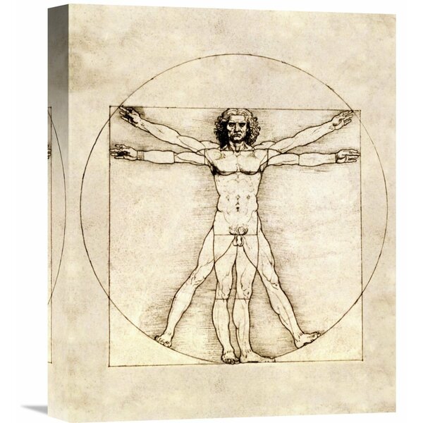
I like this idea a lot. Just a little stick man on a watch face. It could be stylized on the watch a bit, more than just a circle (clock face). Including lugs and crown maybe. Someone sketched something out like this, but this idea further explored could have legs.cuica wrote:Remember the TV series The Saint with Roger Moore? We could have a logo inspired on that. A thin man with his hands at 10:10!
If anyone wants to do any sketching on this, please feel free. Pen and paper work just as well as design software for this phase (known as ideation in case anyone is interested in design process jargon).
Re: MoT Logo?
We could add a Vitruvian theme to the above with the stick man inside a dial and his arms spread at 10:10!Sporkboy wrote: ↑Sun Aug 18, 2019 12:53 pmI like this idea a lot. Just a little stick man on a watch face. It could be stylized on the watch a bit, more than just a circle (clock face). Including lugs and crown maybe. Someone sketched something out like this, but this idea further explored could have legs.cuica wrote:Remember the TV series The Saint with Roger Moore? We could have a logo inspired on that. A thin man with his hands at 10:10!
If anyone wants to do any sketching on this, please feel free. Pen and paper work just as well as design software for this phase (known as ideation in case anyone is interested in design process jargon).


-
The Sultan of SoWhat
- MoT Member
- Posts: 5385
- Joined: Wed Dec 19, 2018 8:52 pm
Re: MoT Logo?
I agree. The T stands for Time, the watch face or head symbolizes O for On (watch dial can be blank or stiylized) obviously a watch, below that denotes a mans body. Man On Time, it is very difficult to denote On Time with a symbol, at least I'm not aware of a way of doing this that would be widely recognized.Sporkboy wrote: ↑Sun Aug 18, 2019 12:48 pmDepth can easily be added with a simple background colored outline on each element. That is what I did with the first one and I can certainly add that to any of the designs.PetWatch wrote:Spokboy, the very first logo has nice depth to it, if this could be increased it would look even better, possibly experiment with colors that recede and stand out.
Dub's logos are good too but unfortunately someone mentioned insects and once seen can't be unseen, they are also close to this logo:
TW.jpg
We do know he can afford the best logo designers. Tiger Woods.
My entry for a little variety, in need of heavy editing.
Mot.png
I think that the wider on the bottom design is out as it does look like an insect. The thin on the bottom/triangle designs are still contenders in my mind.
I see lots of differences to the TW logo, though it is a nice design. Any logo that is initial-based could be considered similar as it is in the same genre. As such, I wouldn’t dismiss them. The TW logo was professionally done as you can see the care and precision done in the spacing and alignment, though the concept is not more sophisticated than anything that an amateur could arrive at.
In your image I am only seeing a T on the center of the watch face, so I think I am missing something about your concept. Could you please explain?
- Mot2.png (163.81 KiB) Viewed 10533 times